
Welcome back, fellow book lovers, to another Which Cover Wednesday! Which Cover Wednesday is a weekly meme I host. What happens is that I compare two different covers of a book and give my opinion of which cover looks better. And I would love to hear your opinions on these covers, too! Feel free to leave comments about them in the section below. 🙂
Here are this week’s covers:
1. My Life Undecided by Jessica Brody
 or
or 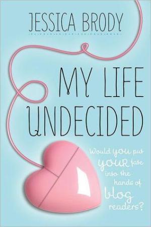
I’m really a fan of the second cover! It’s neat and simple, with its lightly styled typography and the cute heart mouse! I think it fills up space nicely without it being too overwhelming. It also gives readers a little more info on the story. The first cover, while still informative, doesn’t seem as appealing to me with the model’s questioning face being the only anchor to story… Maybe if she was more dynamic, writing her blog and such, it might have made for a better cover.
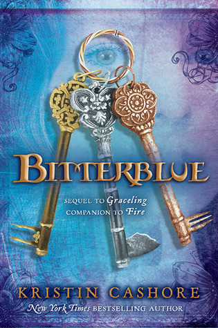
2. Bitterblue by Kristin Cashore
 or
or 
First cover for sure! Did I ever mention my love for rustic keys? Because it is almost as great as my love for buttons! The intricate design of the keys mixed in with that faded out background of a girl staring and the typography makes for a beautiful cover! The second cover, while possessing pretty typography, is kind of boring in comparison with the model merely standing there.
3. Love and Other Alien Experiences by Kerry Winfrey
 or
or 
This one’s so hard because I really like both covers! I love the background of the first one as well as how it plays with different typographies on the cover, although I’m not too fond of the cover art. And while I might not like the second cover’s typography as much, I definitely love its cover art decorating the background. Overall, I think I’ll go with cover number two for using its space efficiently.
4. Second Chance Summer by Morgan Matson
 or
or 
In this case, I’d pick the first cove hands-down! Other than my major appreciation for its typography, I love the background colour scheme with the wood as well as how nicely it represents summer with only a few details. The second cover however seems to incorporate a lot more details, and adding to the fact that its clustered around the title, it doesn’t appeal to me as much.
Well that’s it for this week’s Which Cover Wednesday! If you see any covers you like, give a shout out in the Comments Section below! Have a nice day, everyone! 😉
– Sumaya


July 26, 2017 at 8:13 am
Hi! I agree with your choice on Second Chance Summer. There’s also another cover where taylor is sitting on the dock looking out into the distance but I still think the cover you chose is better because it’s more fun and this book was sad but also fun.
LikeLiked by 1 person
July 26, 2017 at 9:25 pm
I actually saw the cover you mentioned and wanted to use it first, but then I saw the UK version and thought it would be more fun to compare the new one with it instead! 😉 Thanks for sharing, btw!
LikeLiked by 1 person
July 26, 2017 at 10:21 pm
Yeah I had never seen the U.K. one so it was an interesting comparison! I agree, it’s very crowded on that version.
LikeLike
July 26, 2017 at 8:37 am
Agree with all your choices! Both covers for the alien experiences book are great!
LikeLiked by 1 person
July 26, 2017 at 9:26 pm
Woohoo! We’re in sync!
LikeLiked by 1 person
July 26, 2017 at 8:52 am
I
LikeLike
July 26, 2017 at 8:53 am
I like the first cover on all of them best. 🙂
LikeLiked by 1 person
July 26, 2017 at 9:28 pm
That’s cool! Was there any cover you liked in particular if you don’t mind my asking?
LikeLiked by 1 person
July 27, 2017 at 9:36 am
Bitterblue I like the concept of the old keys it has A unique feel about it😊
LikeLiked by 1 person
July 27, 2017 at 9:51 am
Old keys look amazing!
LikeLiked by 1 person
July 27, 2017 at 12:52 pm
😊
LikeLiked by 1 person
July 26, 2017 at 10:59 am
I have such a weakness for nice typography! If I don’t like how the text looks, it’s unlikely that I’ll pick a book up.
LikeLiked by 1 person
July 26, 2017 at 9:30 pm
Ikr? Typography can make or break a book! 😉
LikeLiked by 1 person
July 26, 2017 at 12:09 pm
I…. don’t like any of these covers? They all look a little thrown together.
LikeLiked by 1 person
July 26, 2017 at 9:33 pm
That’s fair! To each their own! Out of curiosity, was there a cover you saw recently (in a bookshop, social media, etc.) that you really liked?
LikeLike
July 26, 2017 at 9:37 pm
Shadowweaver’s cover is beautiful. So it’s Beasts Made of Night. And the new paperback edition for Labyrinth Lost. Which now that I’m thinking about it are all purple lol
LikeLiked by 1 person
July 26, 2017 at 10:49 pm
I had never seen that second cover for Bitterblue before. I’m not going to lie, I don’t like it. LOL. First one for sure!
LikeLiked by 1 person
July 26, 2017 at 10:52 pm
It’s part of the series’ cover revamp. In this case, I’m much more into the old ones!
LikeLiked by 1 person
July 27, 2017 at 11:12 pm
Oh! Yeah…don’t like. The original is gorgeous!
LikeLiked by 1 person