Hello, lovely readers! It’s that time of week again: Which Cover Wednesday! 😀 Which Cover Wednesday is a weekly meme I host. What happens is that I compare two different covers of a book and give my opinion of which cover looks better. And feel free to join in on the fun by commenting on these gorgeous covers below! 😉 And this week’s contenders are:
1. This Raging Light by Estelle Laure
 or
or 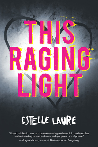
This is a tough one! I really like the ombre colours of the first cover, but I love the typography of the second cover more…. I guess if I had to choose, I’d go with the second one, because it’s a bit more subtle and suited to the story than the first cover’s playfulness.
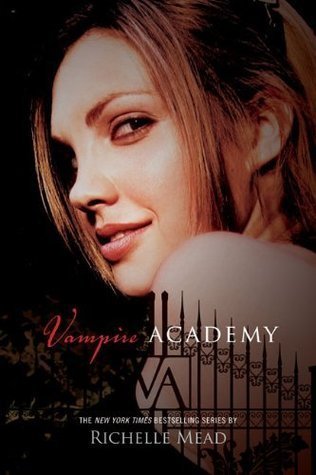
2. Vampire Academy by Richelle Mead
 or
or 
Second cover, second cover, second cover! While the first cover is the one I read from way back when, the second one holds an appeal to me simply because of the velvety rose in the centre. I kind of wish it had more going for it than that, but right now, I like its cover art as well as its bold typography…
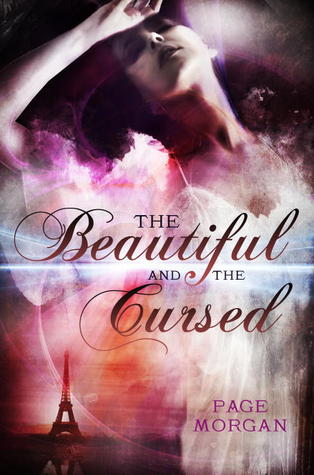
3. The Beautiful and the Cursed by Page Morgan
 or
or 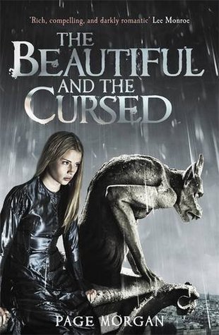
Love that second cover! At first, I really liked the first cover with that ethereal dress the model’s wearing as well as the colours, but the second cover has something going for it. Maybe it’s the model’s expression, like she’s just been fighting some serious bad news, or the fact that a gargoyle is on the cover, alluding to the story more than the Parisian background of the first cover.
4. Chanters by Amy Butler Greenfield
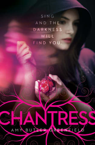 or
or 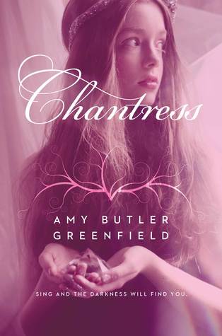
In this case, I’d go with the first cover, seeing as it looks a bit more otherworldly and related to fantasy in some way. The second cover looks more general ( I honestly wouldn’t know if it was historical or contemporary…), but I wouldn’t guess its relation to the story at all! Plus, I like how first cover makes use of its cover art by playing with the typography. Even though the second one has the same kind of cover art, it looks more like a random flourish…
Well, that’s all for this week’s Which Cover Wednesday! Were there any covers that made you look twice? I’d love to hear about it, as well as any suggestions for this meme, in the Comments Section below. Have a wonderful day, everyone!
– Sumaya


April 19, 2017 at 12:19 am
Tough choices this week! I DEFINITELY like the first Vampire Academy cover better. And actually, I think I’d go with option one on all of these. Yep. Option one. 🙂
LikeLiked by 1 person
April 19, 2017 at 2:00 am
They were really tough this week. I had to think a bit more on these because, for the most part, they’re all really gorgeous covers! Thanks for sharing your opinions! I always like hearing from you! 😉
LikeLiked by 1 person
April 19, 2017 at 7:26 pm
My pleasure. I love seeing this post every week. 🙂
LikeLiked by 1 person
April 19, 2017 at 7:29 pm
That makes me so happy to hear! 😊
LikeLiked by 1 person
April 19, 2017 at 1:33 am
Great post. I agree with your choices!
LikeLiked by 1 person
April 19, 2017 at 2:02 am
Thank you! 🙂 Did you have a particular favourite cover this week, if you don’t mind my asking?
LikeLiked by 1 person
April 19, 2017 at 2:06 am
I spurgled a bit and got ‘The Star-Touched Queen’, partly because of the cover, it’s lovely. I also recently finished ‘Rebel of the Sands’ and that has an awesome cover as well.
LikeLiked by 1 person
April 19, 2017 at 2:08 am
The Star-Touched Queen does have a lovely cover! That and its sequel, A Crown of Wishes! And I really like the first cover of Rebel of the Sand (the blue one)!
LikeLike
April 19, 2017 at 3:36 am
Lovely covers.. I was torn between the first two as well.. think I’d still go with the first one, because it’s so vibrant and there aren’t enough books like that so it really stands out to me. For number 2. Definitely the second cover with the rose, not having any doubts about that one !!
LikeLiked by 1 person
April 19, 2017 at 3:43 pm
That’s fair! I really like the colours of the first one, too! It’s just the second one that appeals to me more… 😉 I hope they continue using those covers for all the Vampire Academy books!
LikeLiked by 1 person
April 19, 2017 at 12:18 pm
For this raging light I like the ombre colors. For The Vampire Academy I like the black cover and for the beautiful and the cursed I liked the colorful one!
LikeLiked by 1 person
April 19, 2017 at 4:34 pm
The ombré colours do look nice! And I can see why you’d like the first cover of The Beautiful and the Cursed if you like the colours of This Raging Light’s first cover! 😉Thank you for your input, by the way!
LikeLike
April 19, 2017 at 1:47 pm
#2 – I freggin’ love the Vampire Academy! Those books kicked butt. I really love the new 10th Anniversary cover. Alot better than the other one. 🙂
#1 – I like the second cover
#3 – I like the second cover
#4 – I like the first cover
LikeLiked by 1 person
April 19, 2017 at 4:36 pm
That was one great series about vampires! That and the Bloodlines series.
OMG! Our opinions match! 😁
LikeLiked by 1 person
April 19, 2017 at 8:17 pm
What is the Bloodlines Series? I don’t think I read those??? I love it we have books in common. A new person to book gossip with. 🙂
LikeLiked by 1 person
April 19, 2017 at 8:52 pm
The Bloodlines series is a spinoff series of Vampire Academy starring Sydney and Adrian. It was pretty good, as a whole. While I love hearing about new books, I love talking about the oldies I’ve read as well! 😁
LikeLiked by 1 person
April 19, 2017 at 9:02 pm
Me too! Have you read House of Night Series or Morganville Vampire series? They are also really good… I tell you though that I’m having a hard time getting followers for my blog. 😦 any suggestions
LikeLike
April 19, 2017 at 9:19 pm
I’ve read the House of Night series, and I liked it until a certain point, like around book 10… And I haven’t read the Morganville Vampire series yet. Is it any good?
LikeLiked by 1 person
April 19, 2017 at 9:21 pm
I read house of night same like you about book 10 And lost interest and the Morganville vampires was actually very interesting and fun to read. I read it up to a certain point to and kind of got stuck on another genre never went back. I might pick it up again tough. They are pretty good.
LikeLiked by 1 person
April 19, 2017 at 10:27 pm
I’ll be sure to check out the Morganville Vampires and see what they’re about! As for advice on gaining followers, it’s mostly just keep blogging and they’ll eventually come. Another thing to do is share your posts on different sites, like Goodreads, bookseller sites, social media,etc. That way , you make it more possible for people to check out your posts. But more importantly, focus on your blog and have fun with it! 🙂
LikeLiked by 1 person
April 20, 2017 at 6:23 am
Thanks Sue🤓
LikeLiked by 1 person
April 20, 2017 at 11:26 am
You’re always welcome! 😁
LikeLiked by 1 person
April 19, 2017 at 2:45 pm
WOW! The vampire academy cover is a MASSIVE improvement with the rose! The original cover is probably one of the worst i’ve ever seen!
LikeLiked by 1 person
April 19, 2017 at 4:38 pm
The rose is really pretty! Hope they change all the Vampire Academy covers to match that design!
LikeLiked by 1 person
April 19, 2017 at 4:14 pm
I guess I’m just weird, I really like the old Vampire Academy covers much better. I honestly don’t know why! 😊
LikeLiked by 1 person
April 19, 2017 at 4:37 pm
It’s not weird at all! We’re all entitled to our own opinions! 😉
LikeLike
April 19, 2017 at 4:59 pm
Great post! I agree with all your opinions, and I love this meme! I’ll definitely have to participate.
LikeLiked by 1 person
April 19, 2017 at 5:11 pm
Thank you! It’s really nice to hear that! And I can’t wait to see what you come up with! 🙂
By the way, did you have a favourite cover in this week’s Which Cover Wednesday?
LikeLiked by 1 person
April 19, 2017 at 5:28 pm
I really liked the second cover of This Raging Light! I love the color contrast and now I’m really interested in seeing what this book is about haha.
LikeLiked by 1 person
April 24, 2017 at 11:14 am
That first THIS RAGING LIGHT cover though
LikeLiked by 1 person
April 24, 2017 at 12:45 pm
The colour scheme is amazing, I’ll give it that!
LikeLiked by 1 person
May 16, 2017 at 5:12 pm
What a cute idea! Love this concept.
LikeLiked by 1 person
May 16, 2017 at 5:17 pm
Thank you! 🙂
LikeLike