Hello, everyone! Welcome back to another Which Cover Wednesday! For those of you who don’t know, Which Cover Wednesday is a meme I host where I compare two different covers of the same book and suggest which one is more appropriate for the book. And you can join in on the fun as well, by commenting about these covers in the Comments Section below. Well, this week’s titles are:
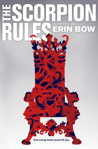
1. The Scorpion Rules by Erin Bow
 or
or 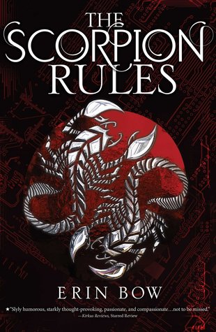
I love the second cover! Where to begin? There’s the font, which looks gorgeous, as well as the intricate background design and the two metal scorpions front and centre!
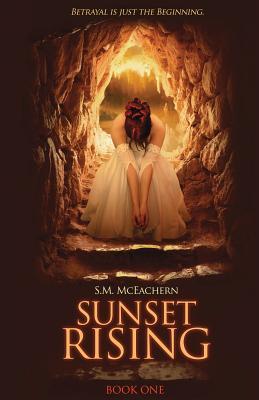
2. Sunset Rising by S.M. McEachern
 or
or 
In this case, I’d go with the first cover. It’s just that the first cover is a bit more connected to context, when compared with the second cover… I have to admit that the second cover has more of a dystopian feel to it, though! 😉
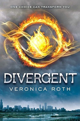
3. Divergent by Veronica Roth
 or
or 
While I like both of these covers, I think I’d choose the first cover because it’s simplistic yet elegant. The second one, on the other hand, feels like there is too much going on in the cover, from the text on the side, to the birds, to the girl sitting on a rock outside of civilization.
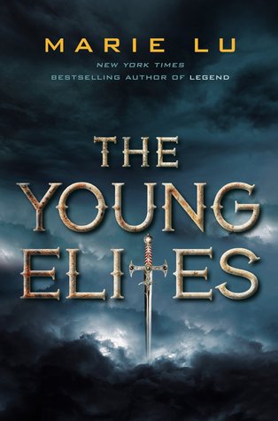
4. The Young Elites by Marie Lu (English and Serbian)
 or
or 
Second cover all the way! Look at that font; it’s so pretty! Then there’s the way the sword is positioned in the design, so it can be used as an integral part of the cover, rather than just a small detail. And even though I can’t place the significance of the background (if there is one), I still acknowledge that it looks amazing! 😀
That’s all for today! See any covers that caught your eye? I’d love to hear about what you think about them in the comments below! Thanks for reading and have a nice day! 😉
-Sumaya


June 30, 2016 at 1:13 am
The Scorpion Rules cover #2 is so much better than #1 in every way, the font, colors, artwork, layout, everything. I love it so much it makes me want to read the book.
LikeLiked by 1 person
June 30, 2016 at 3:48 am
I know right? It’s gorgeous! ❤
LikeLike
June 30, 2016 at 5:23 am
The second over for The Scorpion Rules is so powerful! I also prefer the first cover for Divergent, although I own the second one.
LikeLiked by 1 person
June 30, 2016 at 10:52 am
The scorpion rules cover DEFINITLEY #2(I like the colours and the design), for Divergent, I would choose the fist cover :)!
LikeLiked by 1 person